BLOX Wayfinding System (Teaser)
Agency:
Designit
Client:
BLOX / Realdania By & Byg
Role:
Design Lead
Year:
2021
BLOX is one of the most iconic and most discussed buildings in Copenhagen. It is an international creative hub, housing small startups and larger organisations such as The Danish Center for Architecture and Danish Design Center.
It engages people in architecture, design and sustainable urban development through exhibitions, events, business development and new partnerships. The doors are open for everyone who wants to experience, sense and understand life in cities, and for everyone who wants to take part in professional networks and deep specialist environments to develop the sustainable cities of the future
Agency:
Designit
Client:
BLOX / Realdania By & Byg
Role:
Design Lead
Year:
2021
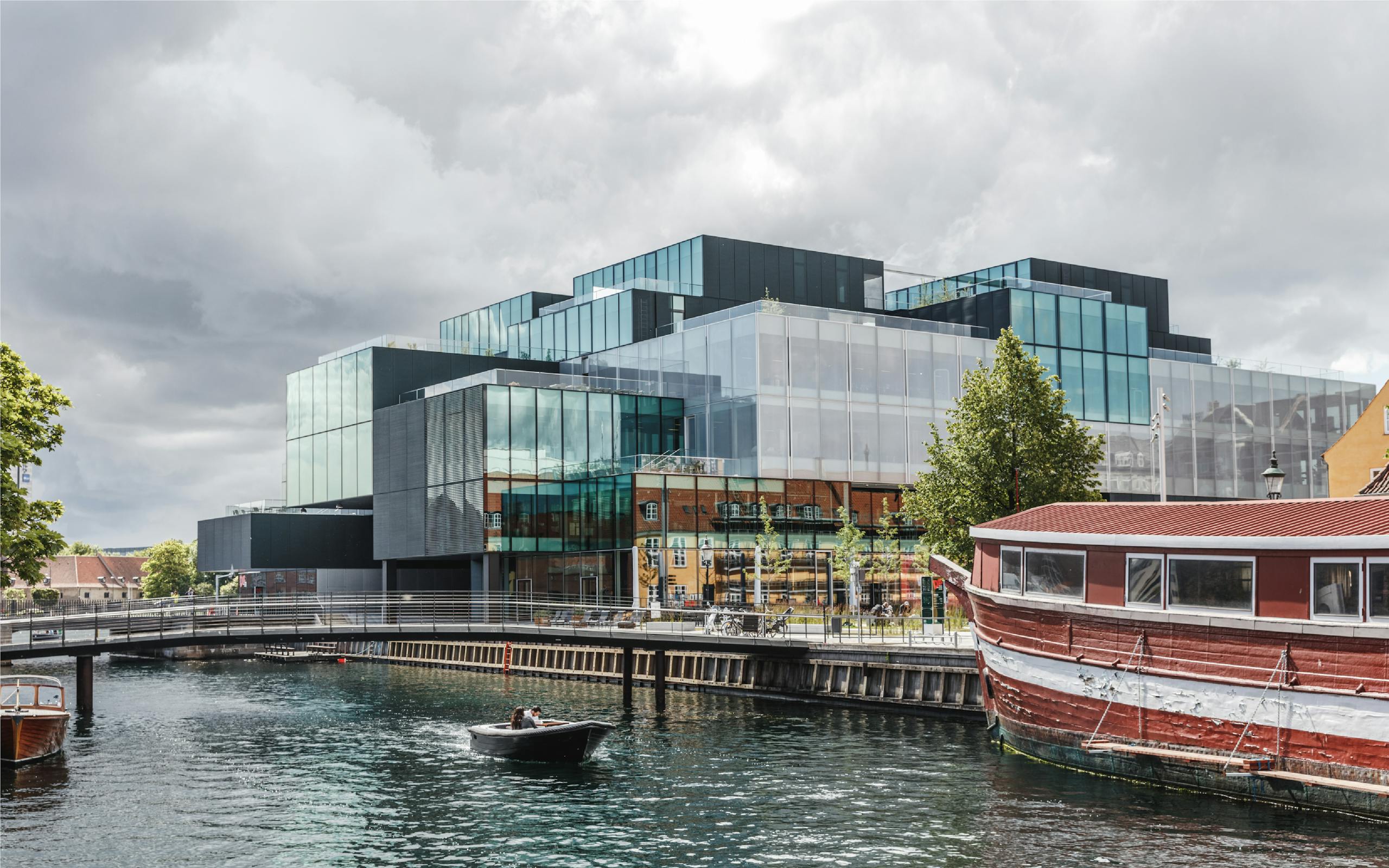
↑ BLOX seen from Frederiksholms Kanal
Challenge
BLOX is inherently complex to understand and navigate. A few years after its opening, BLOX still faced challenges communicating what it is, who it is for and how to navigate the premises. Visitors got lost, tenants wasted valuable ressources and the landlord Realdania operated a difficult business.
Realdania consequently came to Designit to help increase the tenant and visitor experience by re-thinking the building’s journeys, touch-points and the entire way finding system bottom-up.
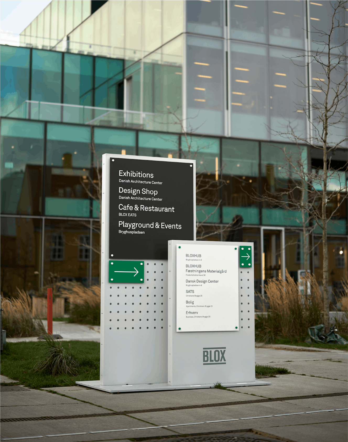
↑ Informative totem at Christians Brygge
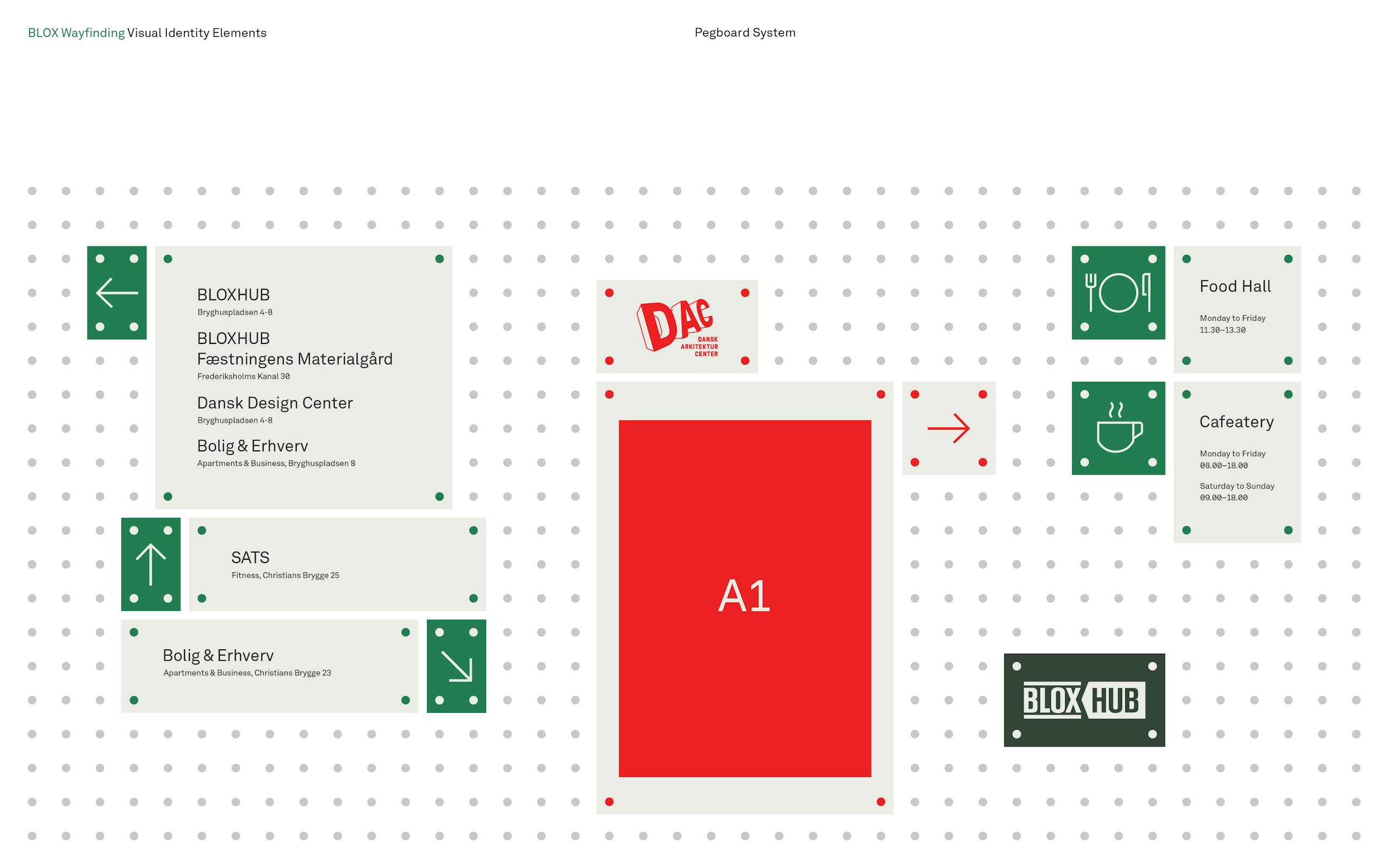
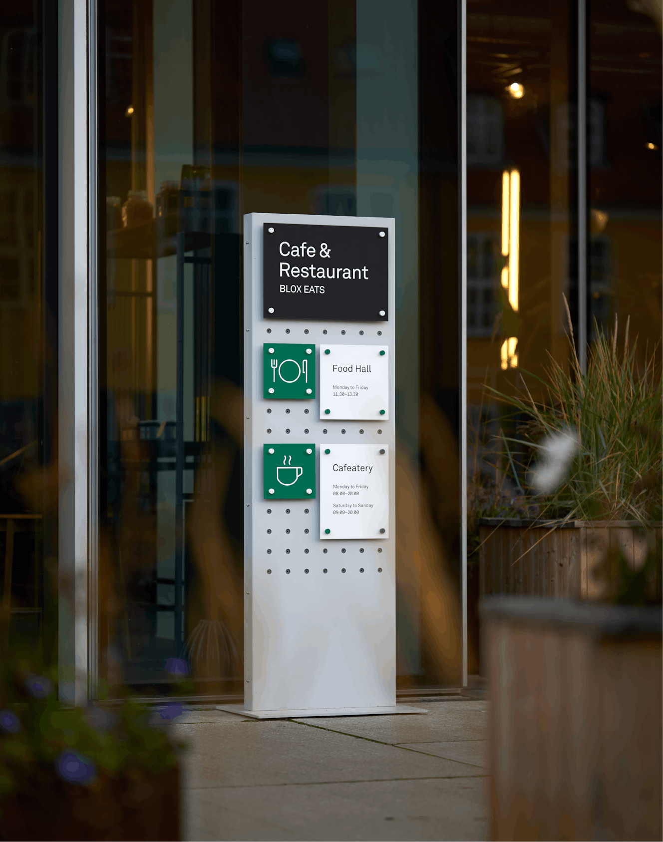
Introducing a pegboard system
The pegboard system allows for flexibility when updating way finding elements as well as reflect the dynamics and activities that BLOX stands for.
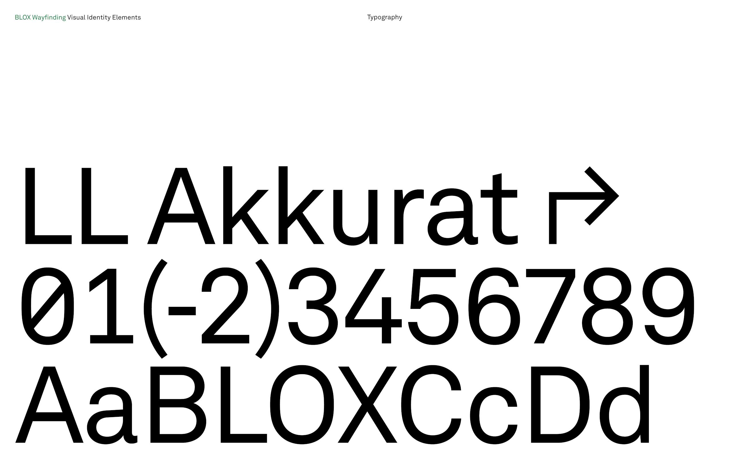
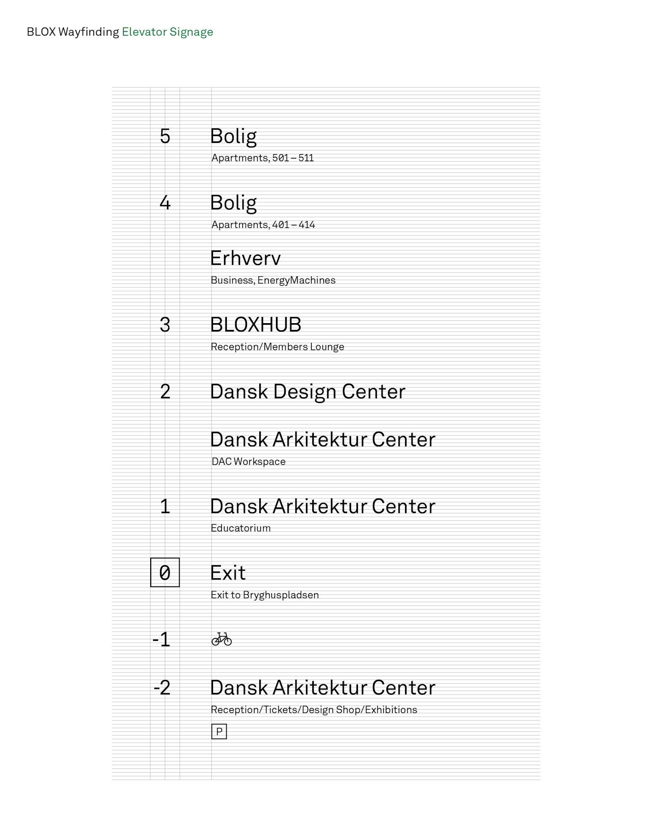
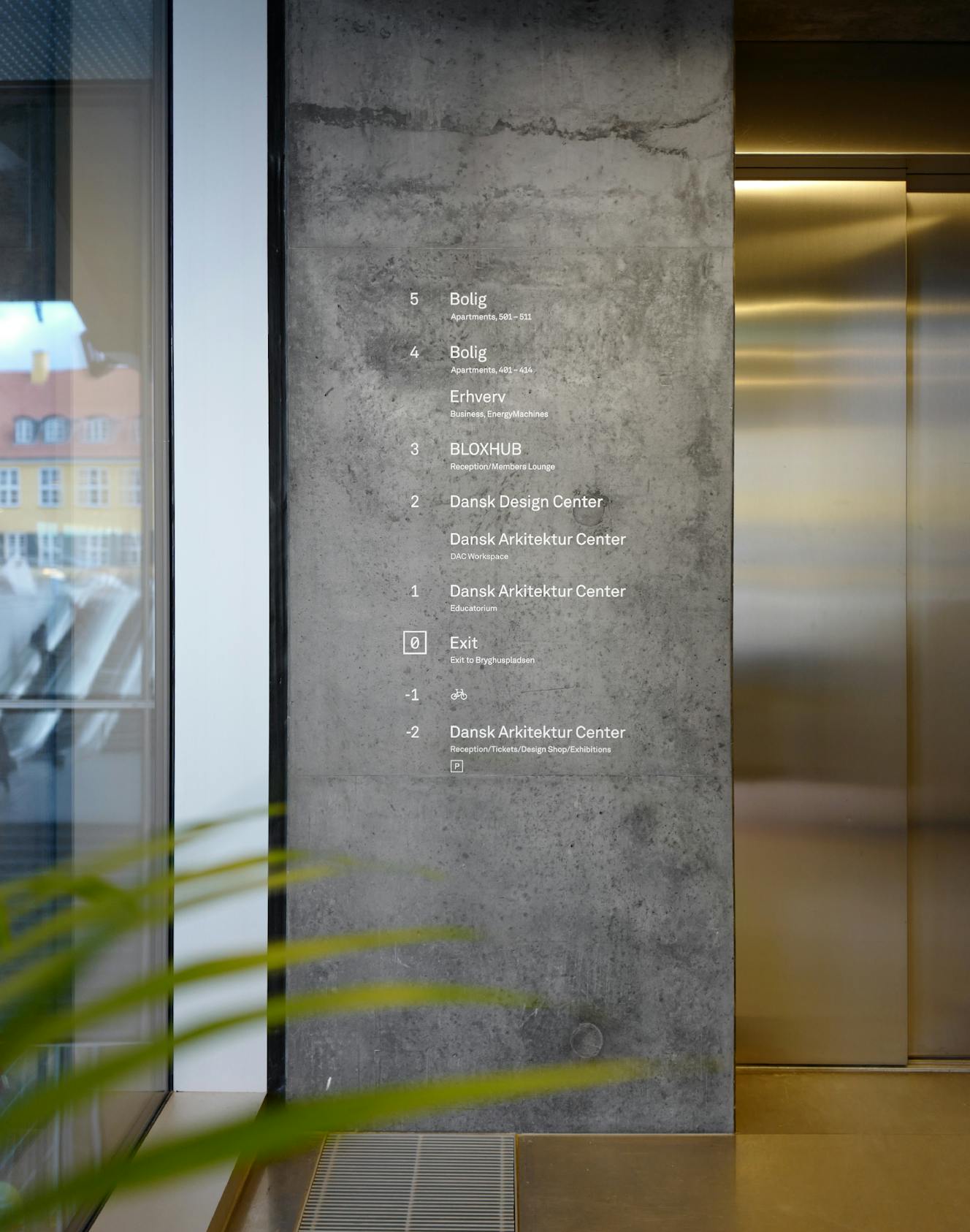
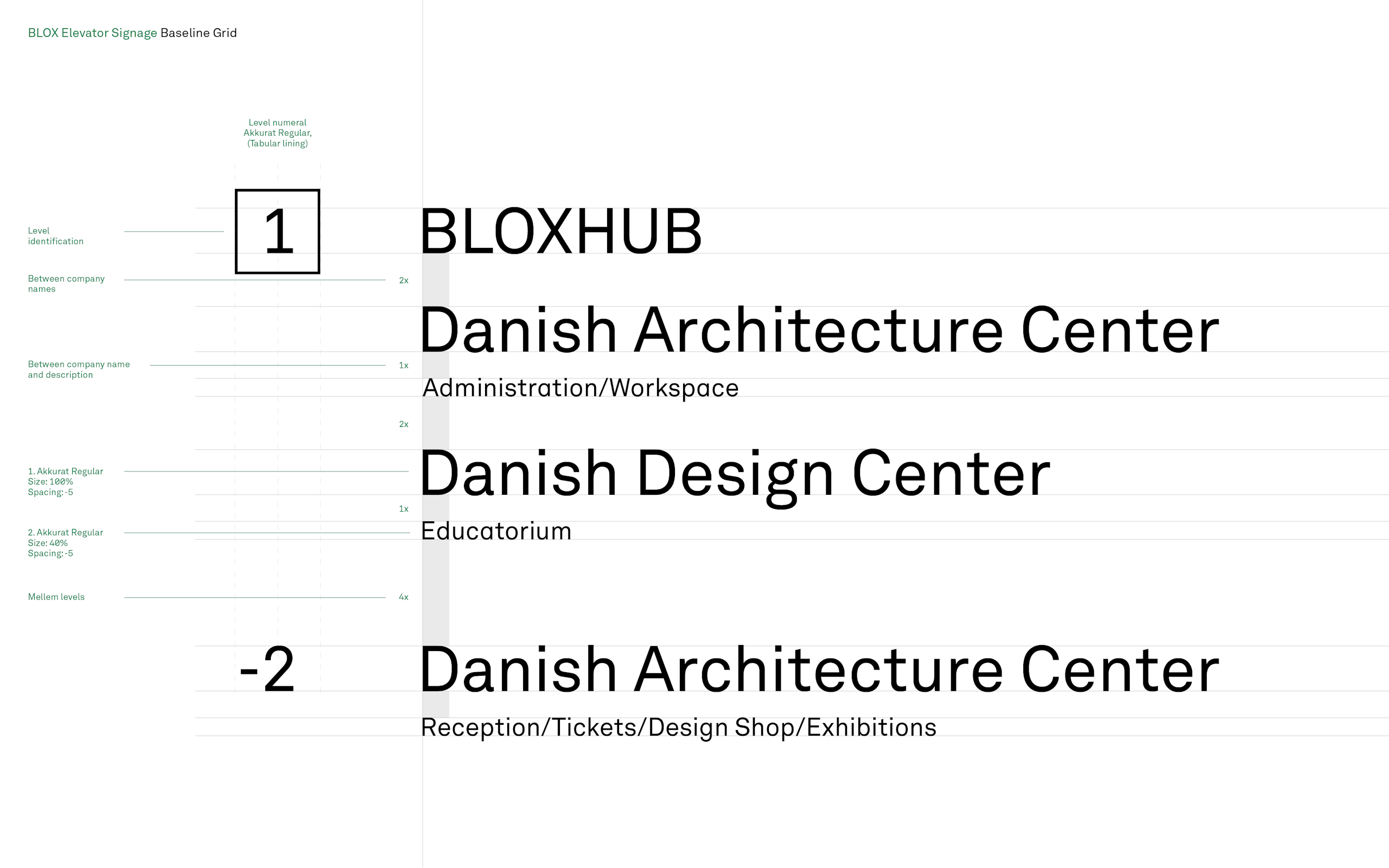
↑ Informative totem at Frederiksholm Kanal
Rethinking brand and information hierarchies
A few year’s after its launch people still did not understand what BLOX was about or what it could offer. Even when passing by, visitors would still be insecure whether the building was open or closed to the public. Additionally, the lack of clear information hierarchy has lead to delays, confusion, heavy work-loads, and individual work-arounds for the tenants and inhabitants.
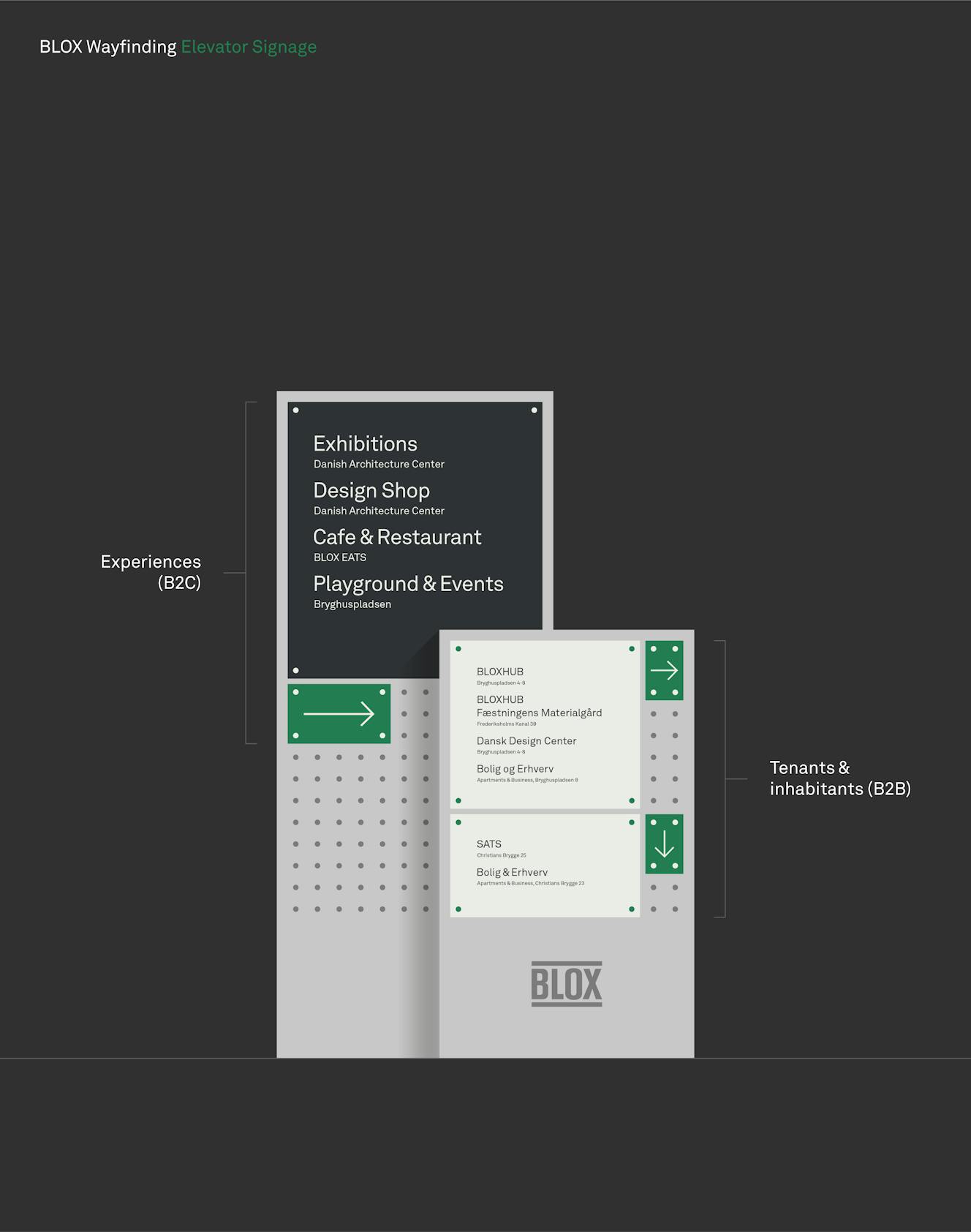
In order to solve this, we established a clear visual seperation of what is open to the public (B2C) and what is closed to the public (restricted to businesses and inhabitants). This information hierarchy was applied to the three informative totems.
Creative Director:
Carsten Henriksen
Service Design Lead:
Sebastian Campion
Brand Design Lead:
Thorbjørn Gudnason
Senior Brand Designer:
Per Nordström
Senior Project Manager:
Anne-Dorthe Klein
Production & Manufacturing:
Dansign
3D Rendering:
Christian Ludvigsen
Photography by
Rasmus Hjortshøj
Pierre Mole
Thorbjørn Gudnason
Red Dot Award 2022 Winner – Spatial communication
The full case study is under development.